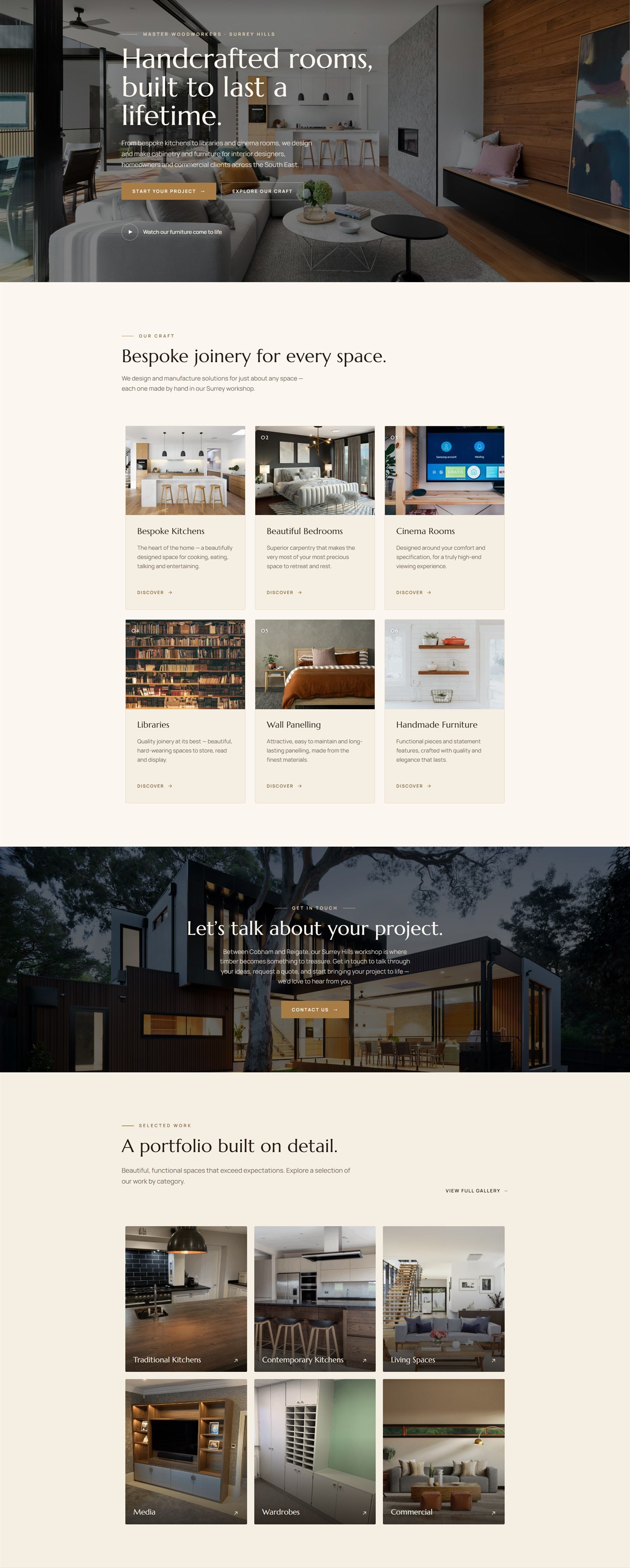
A calm, editorial site for a five-person joinery workshop: six service lines, a six-category portfolio, a team section and a consented enquiry flow. Built white-label, so the agency ships it under their own name.
Results at a Glance
The client is a small workshop in the South East, making bespoke kitchens, libraries, panelling and cinema rooms for homeowners and interior designers. Their buyers are people who notice detail for a living, so a generic trades template was never going to hold up.
The work came through an agency rather than direct. They owned the client relationship and the design direction; I owned the build. Their name goes in the footer, mine appears nowhere on the site, which is exactly how a white-label arrangement should read from the outside.
Restrained editorial layouts are harder to build well than busy ones. There is nowhere for a misaligned column or an inconsistent margin to hide, and the typography has to carry the whole page. On top of that the site had to stay fully editable, because a five-person workshop is not going to call a developer to swap a photograph.
Restraint is unforgiving
An editorial layout has no clutter to hide behind. Every margin, rule and line-height is visible, so the build has to be exact rather than approximately right.
A craft brand, not a trades one
The audience includes interior designers. The site had to look considered enough to sit next to the work it was selling.
A five-person team edits it
No in-house developer. Photos, prices and copy all had to be changeable from the standard editor.
Consent had to be explicit
A UK enquiry form collecting name, phone and project detail needs a deliberate opt-in, not an assumed one.
The challenge was real, and it was costing time, money, and client experience.
Native-first, the same standard as every build I hand over: stock Salient and WPBakery elements do the structural work, with a custom CSS layer for the serif display type, the cream and timber palette and the fine rules that separate sections. Nothing important is locked inside a custom shortcode, so the next person to open the editor sees components they recognise.
Around the layout: a six-card craft grid, a six-category portfolio, a team section carrying each joiner by name and role, a testimonial carousel, and an enquiry form with an explicit data-handling consent checkbox rather than a bare submit button.
The solution was designed from the ground up to fit this exact business.
Mapped the supplied direction into Salient rows and native elements before building anything, so the structure was decided once.
Set the serif display and sans body pairing plus the cream and timber tokens as a small CSS layer, applied globally rather than per section.
Craft grid, portfolio categories, team, testimonial carousel and contact, each on stock elements so they stay editable.
Multi-field form with a consent checkbox, routed to the workshop inbox and tested end to end before handover.
Each tool chosen specifically for reliability, integration depth, and ease of use for the client.
CMS and page structure.
Native rows and elements, so the client can edit safely.
Type scale, palette tokens and section rules.
Explicit data-handling opt-in on the enquiry form.
The agency got a site they could put their own credit on, and the workshop got one they can run without help.
Kitchens, bedrooms, cinema rooms, libraries, panelling, furniture.
Portfolio split so buyers land on work like their own.
Agency credit in the footer. My name is nowhere on it.
Send me the brief, a Figma file, a reference site or a rough outline, and you'll have a fixed quote with a delivery date within 24 hours.