This firm does not take public sign-ups. Access is by invitation after a conversation, which means the site has exactly one job: explain the model well enough that the right person asks to be considered, and give them nowhere else to click.
Results at a Glance
Most funnels leak because they offer alternatives. A download here, a newsletter there, a chat widget in the corner. Each one is a way for a serious visitor to postpone the only decision that matters.
So this build carries a single call to action from the navigation bar to the final section, and every explanatory block on the page ends by pointing back at it. Nothing else on the page is clickable in a way that leads away.
Explaining a private investment process to someone who has never been through one, without the site making claims on the firm's behalf, and while keeping the whole page pointed at a single request. The copy structure had to carry the explanation because there is no product to demonstrate.
Every alternative is a leak
Downloads, newsletters and chat widgets all let a serious visitor postpone the decision.
The process is unfamiliar
A first-time investor needs the whole arc before they will start it.
Access is not self-serve
There is no account to create, so conventional funnel patterns do not apply.
The site must not overreach
Everything published has to stay the firm's own statement, not the build's.
The challenge was real, and it was costing time, money, and client experience.
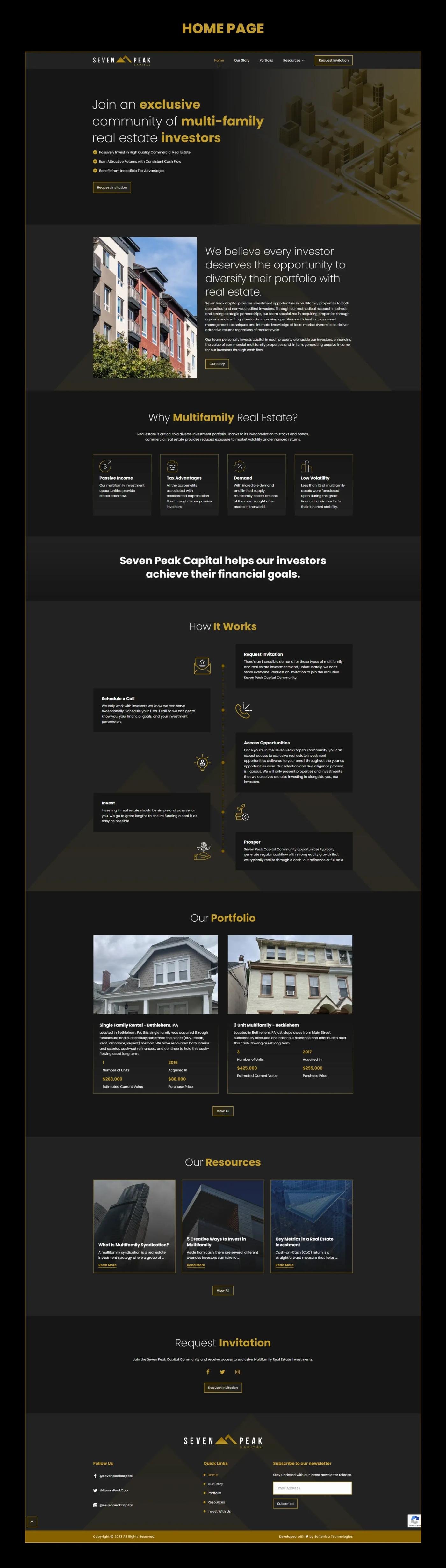
The process is broken into five stages laid out as an alternating timeline, so a reader can see the whole arc before committing to any of it. Each stage answers the question a first-time investor actually has at that point rather than describing what the firm does internally.
The page is styled dark with a single accent so the one button reads as the only interactive element on screen. Everything the firm publishes about itself lives in its own sections, and the request block repeats at the foot of the page for readers who scrolled the whole thing before deciding.
The solution was designed from the ground up to fit this exact business.
The full process laid out before a reader commits to any of it.
No downloads, no newsletter, nothing competing with the one request.
Dark layout with a single accent, so one element reads as interactive.
The request block returns for readers who scrolled the whole page first.
Each tool chosen specifically for reliability, integration depth, and ease of use for the client.
Pages, process content and resources.
One action carried from nav to footer.
Spam handling on the request flow.
One accent so the CTA is the only bright element.
A gated funnel where the explanation does the qualifying.
The whole arc visible before anyone starts it.
The same request from the navigation bar to the last section.
No download, no newsletter, nothing to click away to.
Send me the brief, a Figma file, a reference site or a rough outline, and you'll have a fixed quote with a delivery date within 24 hours.