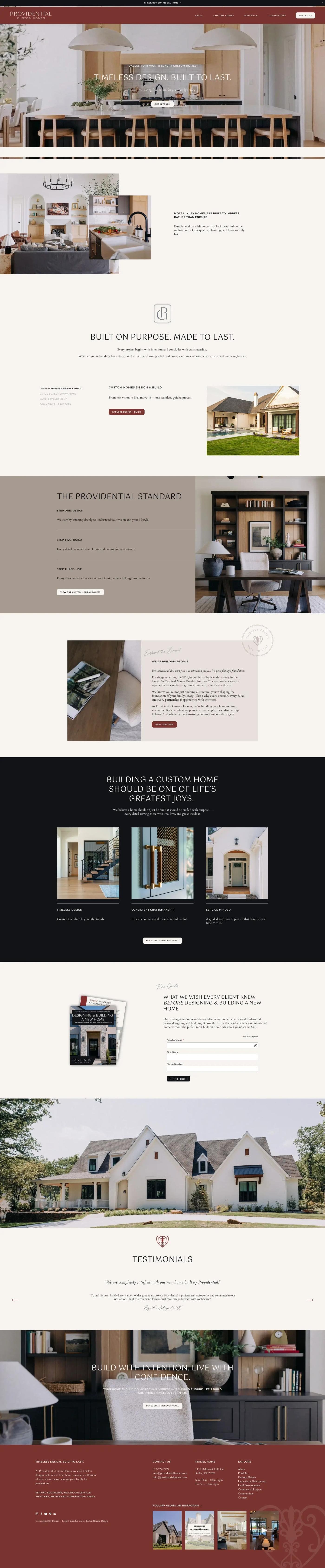
A builder selling a six-figure decision cannot lead with a services list. This site leads with the houses, then gives a buyer the three things they actually check before enquiring: who the family behind the company is, what has already been built, and where they can walk through something in person.
Results at a Glance
Custom home buyers do not compare feature lists. They look at rooms, and they decide whether the standard of finish matches what they imagined. That makes image treatment the primary design problem rather than a decorative one.
So the layout gives photography full-bleed width and lets the type stay quiet around it. The brand voice sits in short editorial blocks between the images, which is where the six-generation family story and the Master Builder credential do their work.
Four separate audiences arrive at a builder site: buyers browsing finished homes, buyers looking for land and communities, homeowners wanting a large renovation, and commercial enquiries. Each needs its own route without splintering the brand into four different-looking sections.
Photography has to carry the value
A buyer judges finish quality from images long before they read a word of copy.
Four audiences, one brand
New builds, communities, renovations and commercial work all need a route without fragmenting the site.
The model home is the real pitch
Address and opening hours have to be findable from any page, not buried on a contact page.
Recent work goes stale fast
A portfolio that needs a developer to update stops being current within a season.
The challenge was real, and it was costing time, money, and client experience.
The navigation resolves to five destinations rather than a deep menu: about, custom homes, portfolio, communities and contact. Renovations, land development and commercial work sit in the footer where the people who need them will look, instead of competing for space in the main bar.
Model home details are treated as first-class content, with the address and opening hours in the footer of every page, because for this buyer an in-person visit is the real conversion event. The Instagram feed runs at the foot of the homepage so the most recent work appears without anyone editing the site.
The solution was designed from the ground up to fit this exact business.
Full-bleed photography blocks with quiet type, so rooms read at full width.
Five primary destinations, with secondary work placed in the footer.
Address and opening hours in the footer of every page.
Instagram at the foot of the homepage, so recent work updates itself.
Each tool chosen specifically for reliability, integration depth, and ease of use for the client.
Portfolio, communities and page content.
Full-bleed photography at multiple breakpoints.
Live feed of recent work on the homepage.
Model home address and hours, site-wide.
A brand site where the photography leads and every route ends at a conversation.
Photography runs edge to edge so finish quality reads at a glance.
Four buyer types served without four separate mini-sites.
Recent work appears without anyone editing the site.
Send me the brief, a Figma file, a reference site or a rough outline, and you'll have a fixed quote with a delivery date within 24 hours.
