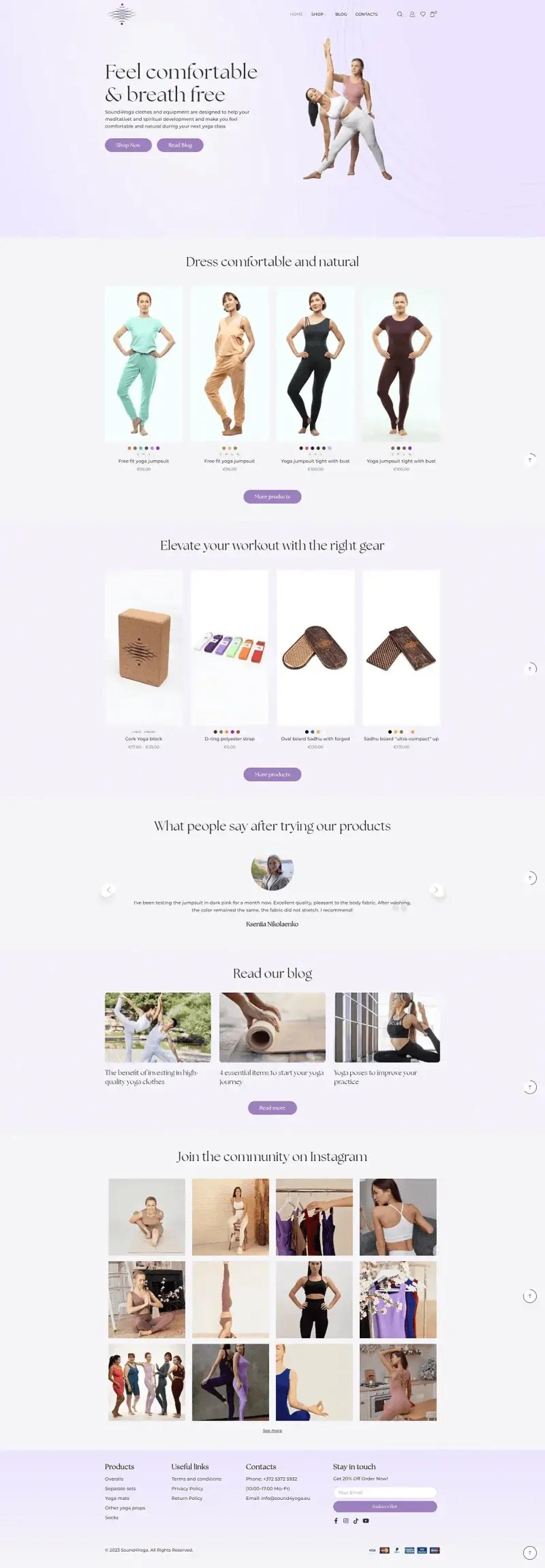
Clothing and equipment are opposite commerce problems. Apparel needs size, colour and fit confidence. A wooden board needs dimensions and a price. This store carries both without letting the apparel machinery clutter the equipment pages or the equipment simplicity strip the apparel of what it needs.
Results at a Glance
A single product template forced across both categories always fails one of them. Clothing pages end up thin, or equipment pages carry empty size selectors that make the catalogue look broken.
So variant behaviour is decided per category rather than globally. Apparel carries colour swatches and size selection. Equipment carries a price range where sizes genuinely differ and a single price where they do not.
A European brand selling internationally in euro, with a catalogue split between soft goods and hard goods, and almost no brand recognition outside its own community. Trust had to be built on the page because the name does not do it.
Apparel needs variants
Size, colour and fit confidence, all visible before the product page.
Equipment needs none
An empty size selector on a wooden board makes a catalogue look broken.
Selling across borders
A small brand needs visible payment methods to close the distance.
The name carries no weight
With no brand recognition, trust has to be built on the page itself.
The challenge was real, and it was costing time, money, and client experience.
Product cards show colour options as swatches at catalogue level, so a customer sees the range without opening each item. Price ranges display where a product genuinely spans several sizes, and a single figure where it does not, which stops the equipment pages from implying complexity that is not there.
Social proof does the work the brand name cannot. A customer testimonial carousel carries named reviewers with specific detail, and a photograph gallery of real customers runs above the footer. Payment methods are shown as marks at the foot of every page, which for a small European brand selling across borders removes the last hesitation.
The solution was designed from the ground up to fit this exact business.
Variant behaviour decided per category instead of globally.
Colour options visible without opening each product.
Named testimonials with specifics, plus a real customer gallery.
Accepted methods at the foot of every page for cross-border buyers.
Each tool chosen specifically for reliability, integration depth, and ease of use for the client.
Content, blog and store pages.
Products, variants and checkout.
Colour options shown at catalogue level.
Accepted methods displayed site-wide.
A mixed catalogue where each product type gets what it actually needs.
Size and colour where apparel needs them.
Equipment pages stay simple instead of carrying empty selectors.
Named reviews and a real customer gallery doing the brand's work.
Send me the brief, a Figma file, a reference site or a rough outline, and you'll have a fixed quote with a delivery date within 24 hours.