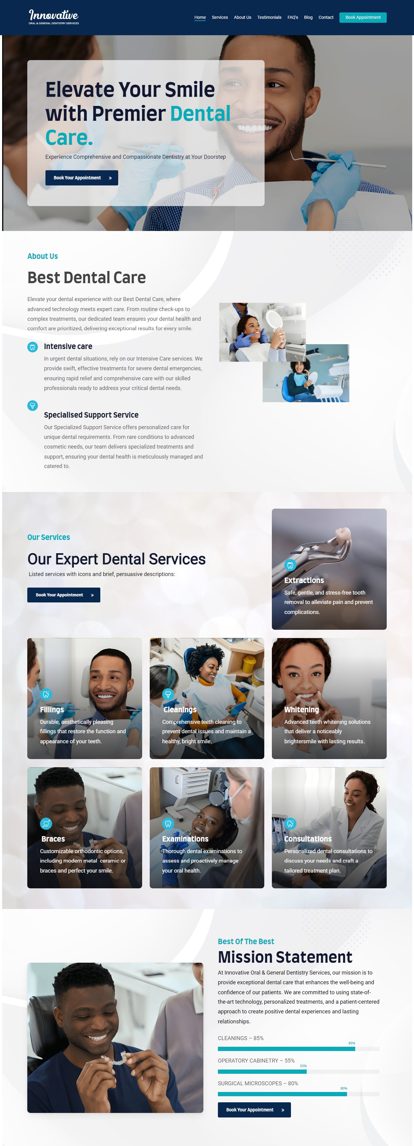
A practice site for a dental clinic in St. Catherine, Jamaica. Seven treatments each get their own explainer rather than a single lumped services list, and the appointment call to action repeats at every point a visitor is likely to decide.
Results at a Glance
Dental patients rarely arrive knowing which treatment they need. They arrive with a symptom. A site that answers with a bare list of service names makes them work out the mapping themselves, and most will not bother.
So the services block gives each of the seven treatments its own card, image and plain-language description: extractions, fillings, cleanings, whitening, braces, examinations and consultations. The booking call to action then repeats through the page rather than sitting only in the header.
Healthcare copy has to be reassuring without overclaiming, and the layout has to work for someone reading on a phone with a toothache. The build also had to stay editable by a small practice with no technical staff, which ruled out anything clever that would break the first time somebody edited it.
Patients arrive with symptoms
Not with treatment names. A list of services shifts the translation work onto the visitor, and most will not do it.
Read on a phone, in discomfort
The layout had to survive a small screen and a distracted reader, so each treatment is a self-contained card.
Reassuring without overclaiming
Healthcare copy has a line it should not cross. The tone had to build confidence without promising outcomes.
No technical staff
A small practice edits this. Everything had to be duplicable from the standard editor.
The challenge was real, and it was costing time, money, and client experience.
Built on stock WPBakery rows and elements with a custom CSS layer for the navy and teal palette, the soft section curves and the card treatments. Keeping to native elements means the practice can add an eighth treatment card by duplicating a row, without a developer and without breaking the grid.
The page is structured as a decision path: hero and booking, who the practice is, the seven treatments, the mission and capability block, then social proof and contact with an embedded map for a clinic people have to physically find.
The solution was designed from the ground up to fit this exact business.
Split the service offer into seven distinct treatments, each with a symptom-led description rather than a clinical label.
Ordered the page as a decision path: reassure, explain, prove, then convert.
Navy and teal palette, soft section curves and card treatments applied as CSS over stock elements.
Embedded location map and full contact block, because a clinic is somewhere people have to physically get to.
Each tool chosen specifically for reliability, integration depth, and ease of use for the client.
CMS and page structure.
Native rows and elements, duplicable by the practice.
Palette, section curves and card treatments.
Clinic location on the contact block.
Seven treatments explained in their own words, with a booking route from every screen.
Each with its own card, image and plain-language explainer.
Repeated at each point a visitor is likely to decide.
For a clinic patients have to physically find.
Send me the brief, a Figma file, a reference site or a rough outline, and you'll have a fixed quote with a delivery date within 24 hours.